How to create a colour scheme for your home
“What’s your favourite colour?”
It’s a question we’ve all been asked since we were young, and our answer is probably one of the seven colours of the rainbow, right? Red, orange, yellow, green and blue tend to be most popular. Less common are indigo and violet.
As adults, we have to get a little more sophisticated. Particularly if we are looking at decorating our home.
Right now, my favourite colour is green. But not the green from the rainbow; I’m talking soft sage greens and all the tonal variations around that. And there are a lot of variations, even just within this seemingly small part of the spectrum.
Choice is great, but it can also be very overwhelming, particularly when picking colours for paint and soft furnishings.
So this blog post aims to simplify the process of choosing a colour scheme, helping you to pick colours that work together to create a cohesive flow throughout your home.
Find your base colour
Let’s go back to that question of your favourite colour. What you think may be your preference may not actually be the reality.
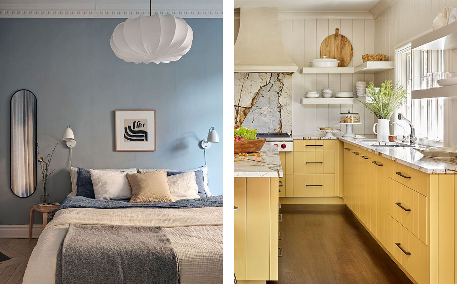
One place I tell clients to look is their wardrobe, as we often wear colours that make us feel happy and uplifted. Nature is also a great source of colour inspiration, as are pieces of art you may own.
Images via John Lewis and Pinterest
I also tell my clients to think about how they want to feel in their own homes: warmer colours such as red, yellow and orange are happy, uplifting and energising, whereas cooler colours like green and blue can have a calming and relaxing effect.
Images via Pinterest
Using the colour wheel
Once you know which colour you are most drawn to and the mood you want to convey, we can use the colour wheel to start pulling out additional colours to build your home’s colour palette.
Image via Google
A colour wheel is basically a circular arrangement of colours showing their relationship to one another. For designers, it’s an invaluable tool to help create colour schemes based on different colour interactions. Here I will explain the three most basic ones to you, which will help inform your decisions when it comes to picking colours for your home.
Complementary
These are two colours that are opposite each other on the colour wheel, such as violet and yellow. They create high contrast from each other. You can also add on the adjacent colour to the opposite (known as split complementary).
Analogous
This refers to any three colours that sit next to each other on the colour wheel, such as yellow, yellow-green, green. They are all similar, hence the name.
Monochromatic
Monochromatic (mono = one, chrome = colour) are all the different shades of the same colour, from light to dark.
Build the palette
Now I’ve explained some basic colour theory, let’s look at my favourite colour green and apply these colour relationships to it.
You can see that by picking its complementary shade of mauve-pink, plus its neighbouring colours of pink and mauve, I instantly have three more colours to work with.
Complementary
Then let’s look at the analogous colours either side of green: yellow, yellow-green and blue-green, blue). I now have a further four shades to add to my palette.
Analogous
Additionally, I also have lots of tonal shades of green to play with when looking at its monochromatic range.
Monochromatic
Here’s what my colour palette is starting to look like:
For those who love colour, embrace the bold hues. However, if, like me, you prefer a more subtle hint of colour in your home, consider using the lighter tints of each:
Find your ‘glue’ colour
Now that I’ve created a palette of colours, the next step is to select a neutral colour to tie them all together.
A neutral doesn’t just mean pure brilliant white (although it can if you want it to). There are a whole range of neutral colours to choose from (I will write a post on this another time) but to keep things simple for now, I like to go for an off white with a hint of grey. My favourite is Low Salt by Coat Paints or White 04 by Lick.
Put it into action
So how do we apply our colour palette to each room in our house?
One way of doing this is to use the 60/30/10 rule. Here’s how it works:
60 per cent of your area will be in one dominant colour: this is usually the walls and will serve as the backdrop for your space
30 per cent will be in a secondary colour: this can be a sofa, bedding, rug, curtains or a feature wall
10 per cent will be the accent colour: this is generally cushions, artwork, a lamp or a throw
We can apply this rule to each of the three colour relationships I explained above to create a balanced look in a room.
You can use your neutral colour on the walls as your 60 per cent if you want something more pared back, adding colour in the furniture and accessories. Here are some examples using complimentary shades of green and pink.
Images via Studio Izzy and @bobbins.at.home
Here’s another set of examples using the analogous pairing of blues and greens. The blue walls form the dominant 60 per cent, the green sofa and throw provide the secondary colour (the 30 per cent), and in this instance the accent shade (10 per cent) comes in the form of a neutral in the artwork and cushions.
Images via Studio McGee and Ideal Home
With a monochromatic scheme, introduce colour in the form of print and pattern, alongside natural elements such as wood and leather, to stop the space looking flat. The image on the left features a dominate colour on the walls, and secondary and accent colours in the form of neutrals and other shades of green. The image on the right has a neutral shade on the walls, and the green panelling and throw form the secondary colours, whilst black metal light fixings make up the accent colours.
Images via Pinterest
Final thoughts
There are few things to bear in mind when it comes to creating a colour scheme for your home.
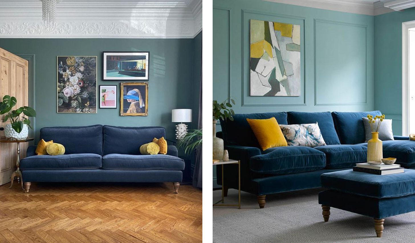
Rules are there to be broken. Don’t be afraid to add a contrasting accent to a monochromatic or analogous colour scheme to stop it feeling too samey
Images via @beetrootandblack and sofa.com
Light has a huge impact on how colour is displayed. What one colour looks like in warm south-facing light will look completely different in cooler north-facing light
I hope this guide provides a basic starting point to creating a colour palette for your home. If you need further help with creating a colour scheme for your home, do get in touch to see how I can help you.


